May 12, 2004

Chuckery

Waking up early leads to opportunity for more adventure for our hero, me. After a morning of biking around waiting for Cyclepath to open, I was heading home empty-handed (having forgotten my gift certificate at home and not wanting to buy a $60 helmet when I could get it free some other time), and who should I run into but ali walking down the street when I turned off Coxwell.

She saw me when I stopped my bike, and breaks into this big alison smile, says "Hey I never run into you!"

and I'm like "yeah, that's crazy," so we stay and talk a couple minutes and I say we gotta do something with people soon, and she says yeah, maybe sunday, she thinks she's supposed to see chloe then and we might do something with that.

so she goes to catch her bus and I'm biking down the street again when a big thing runs across the road and hides under a parked cab. It's like a squirrel, only four times as big. I put my bike down and start walking around the cab looking under it, which probably the cabbie thought was weird, but who cares? The woodchuck was pretty cool about it, it kept walking from one side of the cab to another and I get a good look at it. Then it decides it's gonna be a ninja and it grabs onto the bottom of the cab and pulls itself up. Like Jackie Chan. So that's pretty cool.

Then I left.

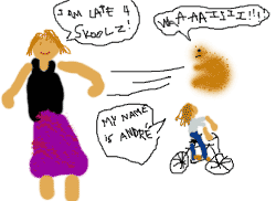
But I wrote a nursery rhyme about my experiences that goes like: "how much woodchuck would ali chuck if ali could chuck woodchuck?" And I attempted to answer this question pictorially, in honor of Leora, as you can see above and to the right.

Now if you'll excuse me, I've got dogs to walk. I'm so free every day. Hope you all watched Zeeky Boogy Doo thing.

May 10, 2004

My Intense Dislike of the New Blogger, in Point Form


Having logged on to Blogger today to find that they've dropped this updated version on me like the New Coke, right from the beginning I wasn't too enthused with the altered layout that emphasizes things I don't find important, pushes stuff I do find important out of the way, and seems generally to imitate the look of the MSN Messenger and AOL Chat UIs. It's ugly, in my opinion, but more to the point, there have been some changes to Blogger's structure that affect workflow in some annoying ways. Here's what I find wrong with the new deal, in order of biggest problem to least important.


  1. Previous posts and the current post typing window are no longer on the same page and not resizable. If I'm typing a post and want to check something I wrote before, I now have to open a new window to do so.

  2. Old posts are no longer displayed in the Edit Posts window. Only a gramatically buggy snippet, generally insufficient to jog my memory and not representative of the post's presentation, is shown, and you must click to launch a copy of your blog in order to view that post specifically.

  3. You can't switch between blogs within the edit page like you used to with that neat pull-down menu in the top bar. Instead you have to go back to the Dashboard and choose a different blog. I really, really hate that part.

  4. A lot of the options previously included in the interface are now hidden and require an extra click.

  5. The buttons are huge and space is poorly used. The old posting window contained all three of the new posting subwindows in a single interface.

  6. It just looks stupid. Everything is massive and bubbly. Rounded corners on everything look like the internet four years ago, and this cappuccino color scheme is ugly. I really hate how big the buttons and tabs are, by the way, and I wish you could still resize the windows.

  7. The whole new window, complete with giant, bubbly-contoured gif, that blinks on while your "publishing is in progress." It's another throwback; the small subtle publish animation from the old blogger looked better, seemed more sophisticated both technically and in terms of style, and didn't necessitate blanking out and reloading the whole damn window.

  8. That stupid dashboard page deserves a sublist of its own regarding why it's terrible:

    • I like to look at blogs in the 'recently published' list if their title catches my eye. Now that list, formerly at the top left side of the page, is at the bottom right, furthest from where my attention would be, and below the lower edge screen. There's no chance of a title accidentally catching my attention, now I have to scroll down to the bottom of the window and deliberately look through the list.

    • Speaking of scrolling, formerly just about the only reason to scroll down the blgger front page window was to read old newsposts. All of the options you needed, except links to the FAQ and HELP sections, were at the top of the screen. This was rather elegant. Now you have to scroll down to see the whole navigation menu.

    • The look of the body of the page doesn't match up with that dark blue header bar.

    • It seems to me they're copying MSN Messenger's, look with this roundness, faded tones, and the shape and layout of the profile section, when they had their own (better?) look already.

    • Why does my 'Blogs' window have to be take up such a huge chunk of the screen when it could be tight, small, and readable at one glance, integrated into the nav menu?

    • What's with this Blogger Gear crap? Fine, Google wanna have a store. Have you looked at what they're selling? Even if their merchandise were made with the cheapest labor in the world, this still only seems like a good way to lose money.

    • This junk about their new look being "geek chic?" You could start by giving the front page a name with some functional significance, instead of "dashboard." Also this crap about "You Power Blogger." Well yay, do I get a cookie? I wish they'd just be honest with us and switch the slogan back. But I'm starting to get picky, really the only issue that matters to me is the brand new mess made of the user interface.


  9. The bright white background where there used to be gray, as in the template window. Helped underline the separation of content and presentation, something Blogger should appreciate as they brag that their new look is fully css-compliant.

  10. The Clear Edits button on the template page does what? Seems redundant to me, when you could just leave or reload the template page without saving your changes, thus avoiding the need for yet another giant-sized button.


On the Pros side:
  1. The Preview feature on the Create a post window is very slick and useful, although it still doesn't display the style of your blog. I also like the post by email.

  2. It's nice that comments are now hosted by Blog*Spot directly, although I imagine those of you on Haloscan will just stick with them for as long as you can, because you can't import those comments into Blogger (can you)? This doesn't matter to me though, as there will be no comments on this page ever, just the guestbook.

  3. It is also nice that Blogger wants to conform fully to web standards, though this isn't too surprising now that they're with Google. Although, if they're really so
    keen on this, why not offer a better syndication standard than Atom?


Why make the sudden change, anyway? Personally I blame all you people switching to LiveJournal for making 'em think they gotta update the look now and make blogger "hip and easy for the kids." It was way better before. Even so, it still beats the living shit out of LJ.

May 05, 2004

I Needed to Share This With You


Owww! My follicles!!!21
I found this while looking for trogdor pics for an unrelated reason


That is all.